Update your home this fall with a little pattern refresh. Intimidating to most, embraced by some, and mastered by few, pattern mixing is the most enticing trend going on these days. With all of the tips, tricks, and techniques out there, it’s easy to get confused on how to confidently bring this look into your home. It’s simple to be safe and only bring one pattern into a room, but the combination of multiple patterns bring so much more interest to your home and, as an added bonus, it also seems like you just may have a designer hiding in your linen closet. This look is extremely stylish and so inherently unique that you can be sure your spaces will not look like all the rooms featured in every catalog that arrives in your mailbox.
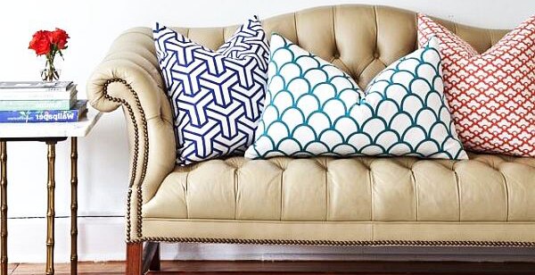
There are many methods for what types of patterns to combine and how to combine them, but the basics really boil down to choosing three patterns in varying scale with coordinating colors.
1. 3 Patterns
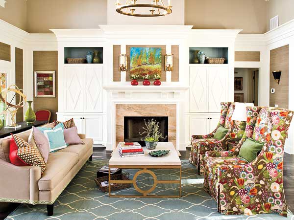
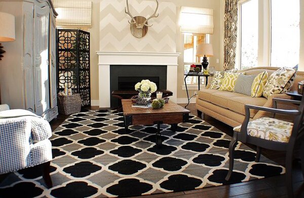
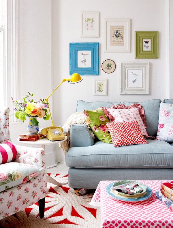
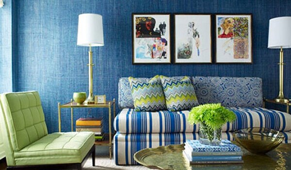
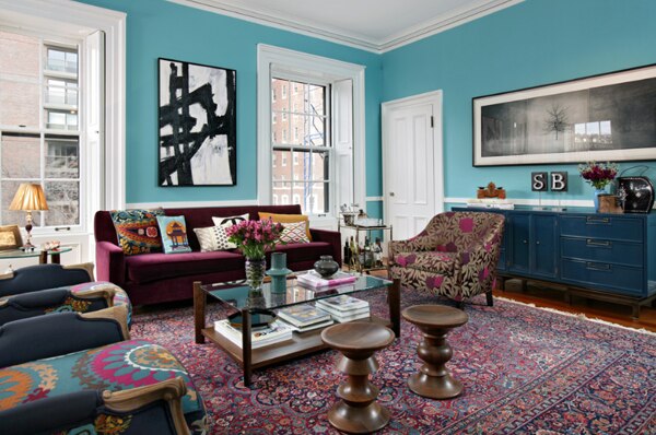
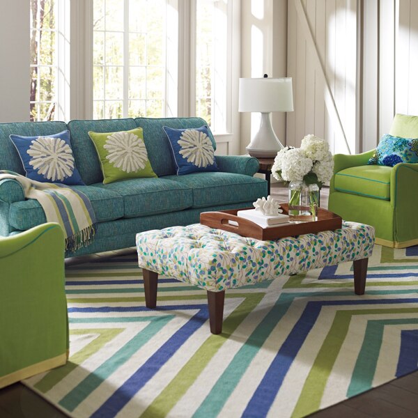
The blend of multiple patterns keep thing interesting. Similar to the pleasing look of grouping three objects together, the same goes for bringing three patterns together. There is visual balance found in uneven collections.
Here are a few style combinations that work well together:
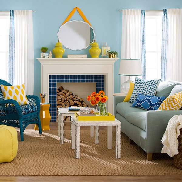
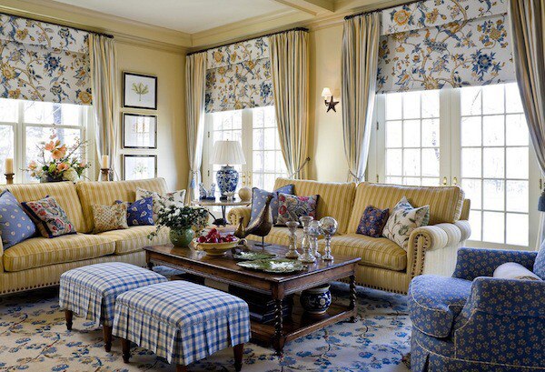
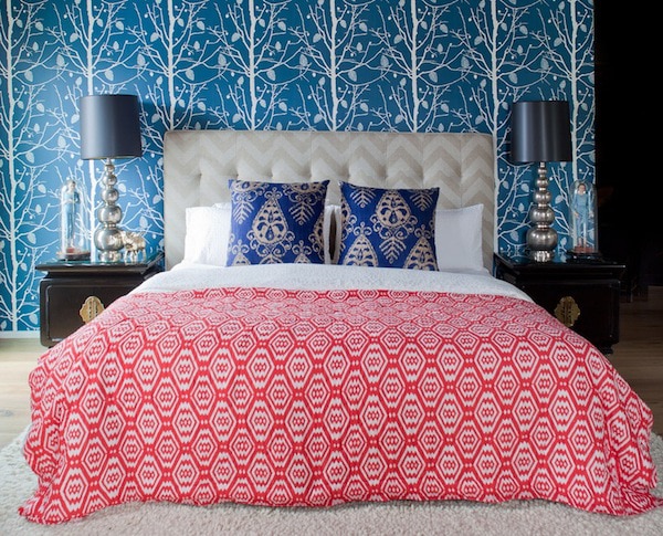
Large Floral, Plaid, Small Floral
Floral, Geometric, Stripes
Polka Dots, Stripes, Floral
Damask, Polka Dots, Chevron
Floral, Ikat, Plaid
Paisley, Geometric, Stripes
Floral, Stripes, Houndstooth
Floral, Chevron, Damask
2. 3 Scales
Too many patterns can easily compete with each other and creating a dizzying effect. By varying the scale of the patterns, they complement instead of challenge each other for visual space. Again, the number three comes into play for the win. One pattern should be large scale, the second should be mid-scale, and the third should be a smaller complementary scale.
3. Coordinating Colors
A simple way to go about tying in different colors is to have the large scale pattern be the most colorful, then the medium scale can have fewer colors, and the smallest scale is best with just one or two. Although this is a solid technique, it’s certainly not the only way to successfully apply colors when working with numerous patterns.
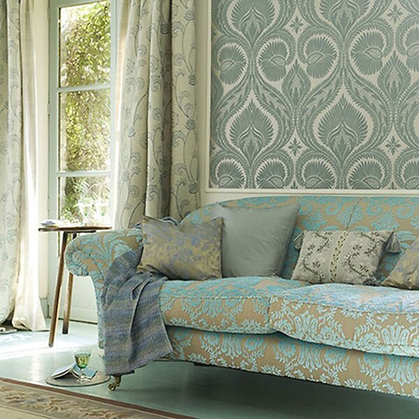
One Base Color
One method is to use one base color throughout all of the patterns. This is a straightforward and calming way to tie different prints of varying scale together.
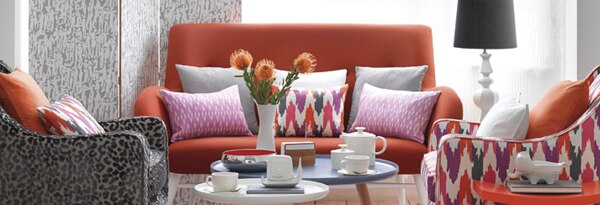
Complementary Colors
Using complementary colors is a good way to add more interest but still keep the color palette from straying too much.
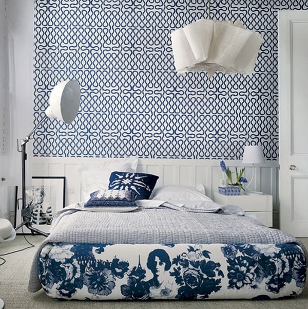
Contrasting Colors
Another approach is to apply contrasting colors. This punchy and energetic look adds excitement to an already interesting mixed décor.
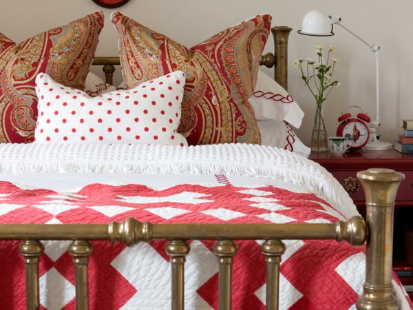
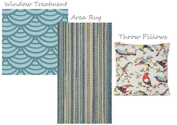
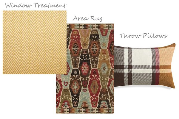
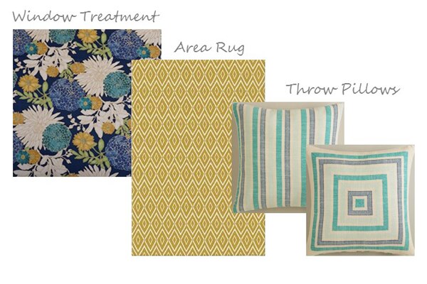
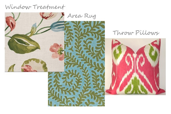
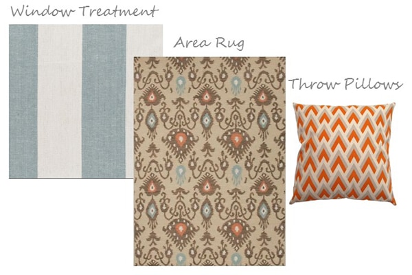
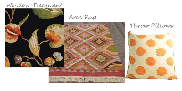
Now that you know all about quantity, scale, and color, you need to know where all this pattern is going to go! I find the best recipe for application is to focus on three essential home decorating elements, window treatments, area rugs, and throw pillows. These everyday pieces have the ability to make a major decorative impact, but may also be switched out fairly easy when you’re ready for a new look. Check out the below groupings for some pattern inspiration!
Now is the season to fall in love with patterns!