The past two years have felt like an eternity, without much solace or optimism. At the beginning of both ‘20 and ‘21, we were hoping for a return to better days, only to be let down as COVID lingers and changes. We have endured much as a country, as a world, seeking commonality in the struggle and the joy in the beauty of community.
It is not surprising that what we are seeking would align with what interior design and color companies are forecasting: comfort, connection and hope. With robust design trends and an array of colors to define the year, there is a special place to be carved out by all who are ready for change.
Paint by Number
As an advocate for small interior changes that make enormous impact, I lean on paint as one of the easiest ways to elevate and modify a space with a limited budget and minimal time invested. Every year, national paint brands announce their colors for the upcoming year and for 2022, it is a study of green with dapples of nude hues.

Green
In response to our continued desire to connect with nature and a universal love for lush indoor environments, most national paint companies favored greens above all other colors for 2022. It’s rare to see a single color saturate the CoTY selections, but considering that we are all living a similar experience, it’s not overly surprising. As a collective, it is a song of grey greens, sturdy yet wistful – safe enough for broad appeal and muted enough to be considered neutral.
Sherwin-Williams unveiled Evergreen Fog, a mid-tone grey green color that is perfect for a multitude of rooms, ideal as a statement color against a monotone palette or floor-to-ceiling color in well-lit living rooms. BH&G introduced their first-ever color of the year, Laurel Leaf, which is inspired by the calming hue of eucalyptus and soothing for a bedroom. Benjamin Moore announced October Mist, a soft, silvery green that effortlessly anchors their larger 2022 color palette. A declaration of soft minty green, Behr’s Breezeway is anchored by a gentle blue undertone, reminiscent of ocean sea glass that resonates in spaces for a subtle undertone, such as the home office or kitchen. Lastly, Glidden introduced Avocado, an aptly named shade of dusty green designed for playrooms and small spaces.

Collections
HGTV Home by Sherwin-Williams dove deeper than one selection and created a color compilation called Softened Refuge, commanded by worn-denim hued Aleutian. The collection is a mix of complementary neutrals and earth tones, 10 colors in all. Valspar also opted to curate a palette of colors instead of a singular statement paint. The 2022 colors of the year range from warm neutrals to soothing blues, 12 total, and are inspired by nature, designed to satisfy our craving for comfort and calm. These complementary collections make it easy to update a single room or coordinate the color palette of an entire home.

Dreaming in Color
Optimism blooms when the first of January comes, and Pantone’s 2022 Color of The Year aligns flawlessly with the resolutions that are cast when the clock strikes midnight. Veri Peri, a refreshing shade of periwinkle, is the first CoTY ever created during the 23-year history of the program. Traditionally, Pantone selects from their vast collection of colors to forecast the year to come but, due to the unique time we find ourselves in, their color committee felt it best to create something that mirrored the time.

“As we move into a world of unprecedented change, the selection of PANTONE 17-3938 Very Peri brings a novel perspective and vision of the trusted and beloved blue color family,” said Leatrice Eiseman, executive director for the Pantone Color Institute. “Encompassing the qualities of the blues, yet at the same time possessing a violet-red undertone, PANTONE 17-3938 Very Peri displays a spritely, joyous attitude and dynamic presence that encourages courageous creativity and imaginative expression.”
This daring and carefree color is intended to inspire our creative spirit and embrace change as we rewrite our lives. Veri Peri echos the merging of our physical and digital lives, channeling color trends in the digital metaverse to our physical world.

To weave Veri Peri into our physical landscape, try pairing with nature infused tones like the color harmonies found in the Pantone color palette, Wellspring. The subtle periwinkle blends in to create a harmonious melody reminiscent of a meadow in spring. Dapple these colors throughout your space in the form of pillows, throws and decorative accessories to create a fresh look.

For those who embrace the trend of postmodernism, seen in the ’80s, I suggest a mixture of cool and warm tones in muted colors, like Pantone color palette, Balancing Act. Layered on top of a neutral room, these tones create a visual interest that elevates and invigorates. Large scale, contrastive art and multi-tonal rugs will unify the space and add drama worth a second glance. Memphis style pieces are also a great choice and spark conversation around their unique and quirky appearance.

As with any Pantone CoTY, it is fun to add just a sprinkle of the color into a space, easy to replace or move without a large investment of time or finance. Something as small as a vase or large as bedding can be utilized to adopt a piece of 2022 without lifelong commitment.

Neutral Embrace
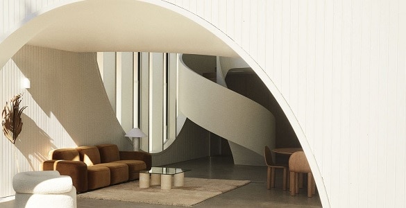
In recent years, our homes have become an extension of the desire to seek refuge inside, yet bind with nature. I jokingly call this design style the “warm hug”, where rooms become cocoon-like, emoting the feeling and safety of a familiar embrace. Furniture with exaggerated curves and heavily textured materials are at the core, creating a story of soft luxury and comfort. The relationship between well-being and nature is evident, with the inclusion of organic modern design and its neutral color palette.

If you are ready for change and love this style, invest in neutral-tone furniture with curved, sculptural lines. Taking a page from postmodernist design, these pieces are reminiscent of decades past with a modern, minimalistic approach, yet chic enough to be trendy and timeless simultaneously.

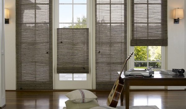
In addition, introducing natural materials, such as those found on woven wood shades, will add texture and interest. My favorites are shades made from a mix of bamboo, reed and grass, like our Blindsgalore Natural Woven Shades.
![]()
Living Greener
Biophilic design is still a top trend in interiors, with plant jungles competing for coveted southwest-facing windows. While I would like to assume that everyone is riding the houseplant train, I am certain that there are a few holdouts that believe themselves pure plant killers. Fear not friends, there are numerous plants that are neglect tolerant and are the perfect fit for beginners and black thumb proclaimers alike.

A personal favorite known for their trailing vines and lush green leaves, is the Pothos, a very communicative and forgiving plant. It’s inexpensive, easy to find, tells you when it’s dehydrated and grows quickly. If lighting is what you lack, try a ZZ Plant or Snake Plant. These low maintenance beauties can survive for long periods of time in low lighting and little water. Hoyas, also known as Wax Plant, prefer to dry out between waterings and love to be rootbound. They come in numerous varieties and have lovely waxy leaves and long tendrils that are perfect for climbing. I grew up with one in my grandma’s home and remember being entranced by their small star shaped flowers.

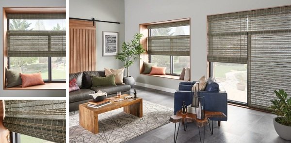
If plants really aren’t your thing, you can introduce green through one of the many offerings from the top color picks for 2022 or color your windows in green. With expanding interest in living naturally, natural shades have been a top pick for many seeking more texture and ecofriendly options for their home. There are multiple materials available in green tones, an exciting detour from the expected browns and tans. Bali Natural Shades have a lovely shade in Highpoint Brook or, if a roman fold isn’t your style, the Westport collection from Bali Pleated Shades has a textured finish and is made from natural materials.
![]()
Multifunctional Spaces
The past two years have unlocked our approach to every room in the home, as we have had to adjust to remote offices and classrooms. This experience opened the proverbial door to all the possibilities of living smaller and smarter. How many of us have guest rooms that sit empty 90% of the year? How else can that space be imagined to create a more useful room? Those who live small are experts in creating rooms with more than one use, utilizing storage and double-duty furniture to expand square footage. It’s time to think big picture about our homes to create an oasis of what we want them to be so we can enjoy every moment within. Be it a craft room storage wall that pulls down into a Murphy Bed for guests to sleep or building up and utilizing every vertical inch to maximize space, it takes just a bit of creativity to imagine what could be.

Our future is beckoning us, be it bright or bleak. Change is coming regardless of any decision; however, it is our choice to embrace or reject what lies ahead of us. I would like to hope that we can gather strength from the loss and heartbreak of many lonely and anxious days. Let’s make our homes the haven we crave and bring joy back into our lives. Color can pave the way to our front door.
