White hot days- icy drinks, vanilla bean ice cream, piña coladas, fragrant cottage roses, twinkling patio lights, sandy soft beaches- what’s not to love about summer, our favorite season of the year? Why not breathe some of the essence of white and light into our home decor to always remember these tranquil, yet dazzling days. Using white as a design statement, opens up small spaces, creates calmness, evokes softness and reflects light. Designing with white can create many moods-lush and romantic, crisp and spare, sleek and sophisticated, pristine and calm, beachy and carefree. A white palette contains so many hues and it is a color, after all, comprising all the colors in the spectrum. However, white can be a tricky color to use, so to avoid a room that does not come together, I have four tips for you to think about before you go “all white.”
1. Select A Hue
Begin with the paint color. White hues vary greatly, so select carefully when you choose your main paint color as the undertones in the paint express different moods. A white paint with cool blue highlights will give your room a clean and sterile look. A white paint with a taupe or yellowish undertone will create a vintage feeling, whereas, a white paint with a gray tint has a more modern and calming effect. Many designers love to rate “the best white paint color.” Benjamin and Moore’s “Ivory White” (925) tops out as the favorite. Another classic white is: Farrow & Ball, “All White” (2005) that is a combo of cool and white tones, a good neutral white. If you are looking for a more stark white, try “Brilliant White,” by Benjamin Moore. I am reminding you that the paint samples below will always be a little off as colors don’t match perfectly on our computers; the pictures will give you a more accurate look, but always take the paint samples home and look at them at different times of the day as the light changes. To be happy with your choice, paint one wall or a big enough sample to ensure you have the right white.
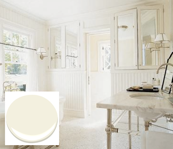
Ivory White, Benjamin Moore
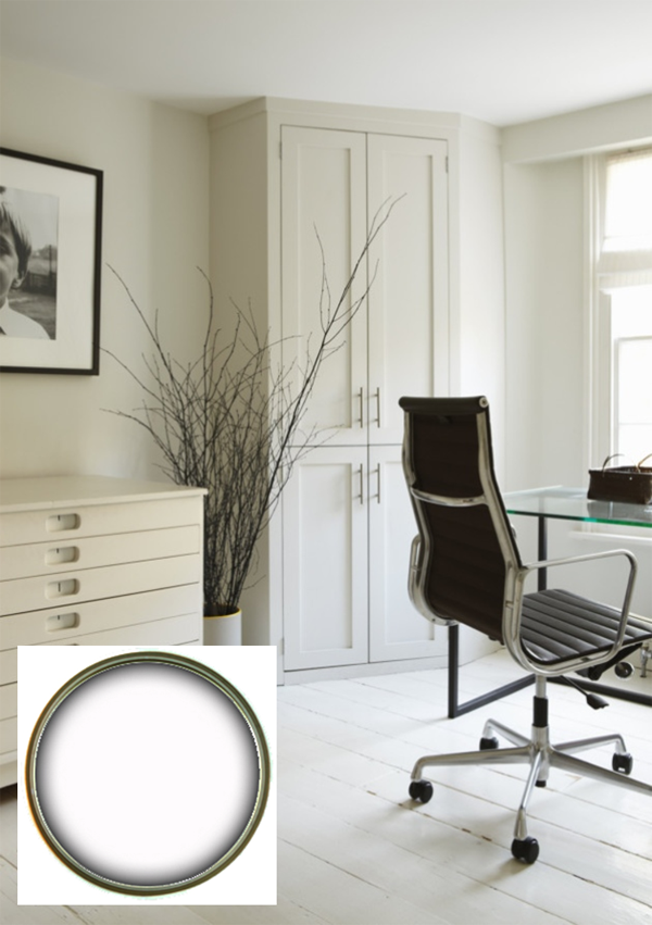
All White, Farrow and Ball
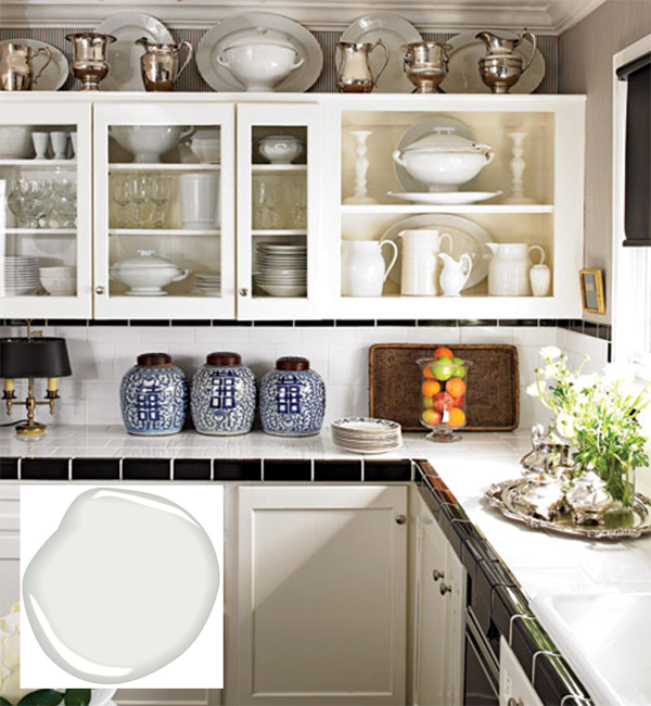
Brilliant White, Benjamin Moore
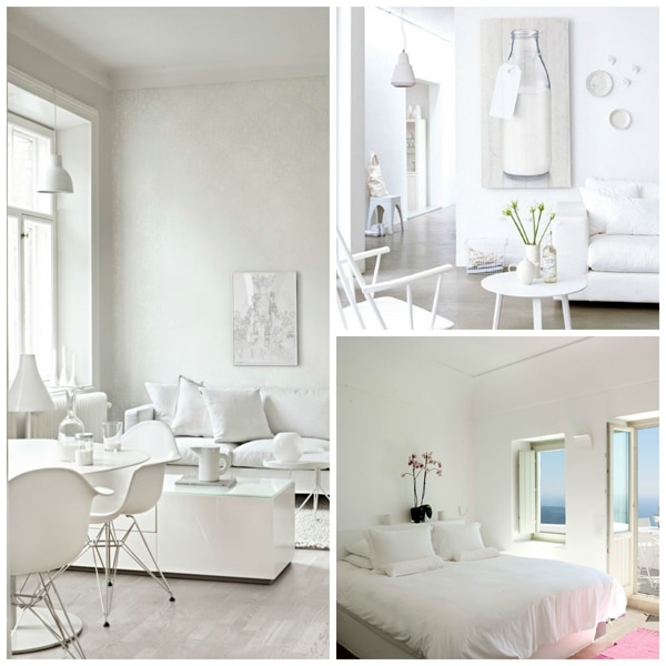
Be aware that if you are really committed to “only” using bright white in your room, make sure that you like the very clean and sharp look of this style; it is not for the faint of heart as it makes a definite statement. If too much white intimidates you but the appeal of this look enchants your design sensibilities, integrate the techniques outlined below to soften the sharper edges of bright white.
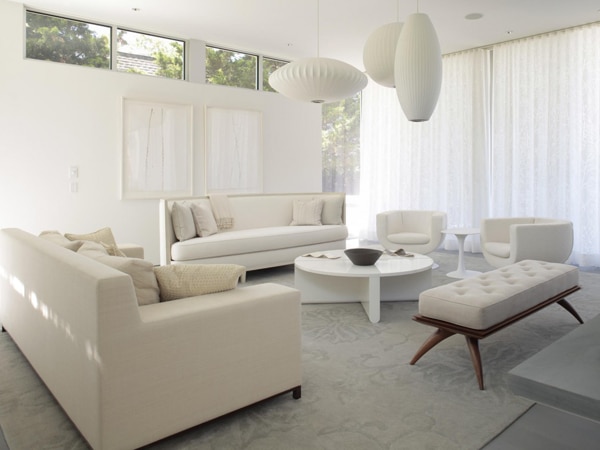
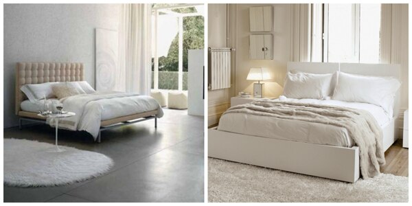
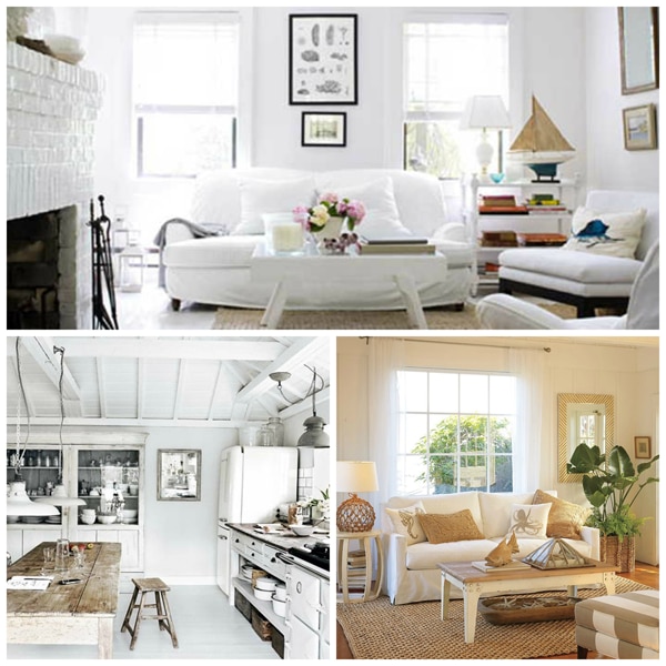
2. Mix Up The Shades of White
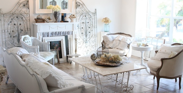
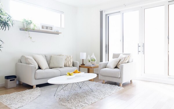
If you look carefully at the most relaxed and comfortable white rooms, you will discover that the most pleasing rooms are filled with many tones of white: vanilla, ivory, oyster, taupe, alabaster, pearl – so many shades of white. Vary all the different whites in accessories, furniture, rugs, and woodwork to create a fresh, multi-layered look that still has the white vibe. Subliminal neutral shades perform magic with white!
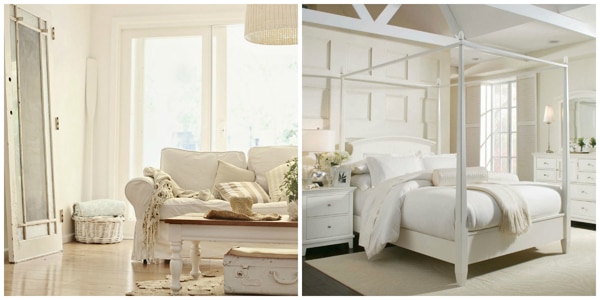
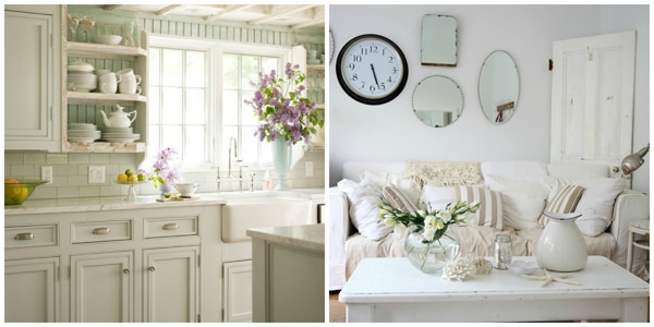
3. Use Different Textures
In addition to using a variety of white tones, add more depth to white by incorporating all kinds of textures. Sisal, jute or any nubby rug, a leather ottoman or an upholstered headboard add interest and dimension. Tapestry chairs or any embroidered fabric covered furniture add a new level of design. Mixing up sheens and patterns and intricate details relieve the expanse of white.
Rustic wood accents warm up a white room and natural accessories in taupe or ivory buffer the starkness of white but retain the crisp and clean look of white. Wood and white contrast but complement each other.
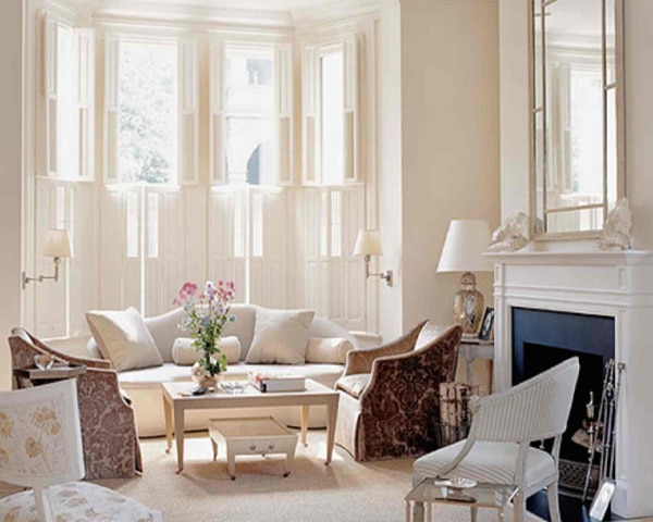
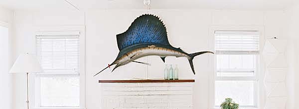
4. Pop It Big or Small
I do think a white room needs at least one spot of contrast, whether big or little. A large colorful painting or how about this awesome sailfish to capture everyone’s attention.
Or, just make a quiet and subtle brush of color with a pastel throw.
I know that I have left out the impact of window treatments in a white room, and as you know, white is our most popular color and we have so many styles, shades, hues, patterns and textures of white that I am going to have to keep this topic for another day, as white window coverings are a specialty all its own!