The New Year’s resolution. How exciting to consider the possibility of a fresh start, setting goals and aspiring to greatness. The start of a new year lets us view the world through rose-tinted glasses, full of positivity and hope. Considering the past few years, it’s safe to claim that collectively we are hoping for unlimited shades of pink and optimism abound. As the world continues to shift back to pre-pandemic existence, we find ourselves desiring quality over quantity and creating connections. We want to spend time with loved ones and ground ourselves with nature. Ever-evolving technology keeps us existing at a rapid rate, creating a world driven by abundance and endless possibility. When you have the world at your fingertips, how could you possibly want more? But the balance of our digital and physical lives can be a delicate one, driving us to gravitate to the stillness of nature. This truth is the precise inspiration color experts drew on to pull together 2023’s collection of colors. To live a full life, we need to walk the line between the digital and our physical world, discovering a heightened appreciation of nature and craving the comforts of the familiar.
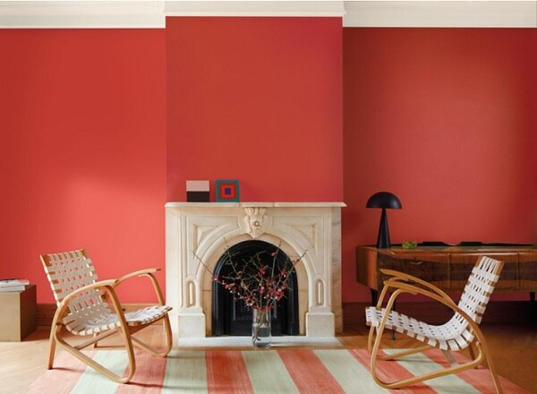
Viva Magenta

Each December the global color authorities at Pantone announce their Color of The Year, designed to foreshadow what the upcoming year has to offer. Created to reflect the latest trends across all sectors including fashion, beauty, design and home décor, it also serves as a mood ring of sorts, whose shade is chosen to capture the zeitgeist. This year’s pick is a celebration of saturation. Vivid and inspiring, Viva Magenta is a bright, energetic pink-hued red that balances boldness with whimsy. It’s difficult not to get swept up in this riot of color that exudes rebellion, fierce grace and yet still presents with the softness of nature.
Chroma this bold can cause even the most fearless creative to baulk, afraid to introduce in the home, but in the spirit of Viva Magenta and the authorities who named it, I say revel in the pure joy of this color and self-express without restraint. Be bold. Be brave. Make a statement.
An easy way to embrace Viva Magenta is to splash paint on a wall. For the fearless, this color would be striking covering wall to wall, it would also radiate as a focal wall in the heart of the home or a lacquered wall in a powder room, shiny as a fresh coat of polish. Even more exciting would be to build tone-on-tone with textiles and furniture in shades of magenta, red and deep pink. If a more subtle, and less permanent, nod is what suits, I recommend bold pops of color with accessories. Envision vases, art or pillows sprinkled like pieces of eye candy throughout a room or even a splash of color that is temporary, like a bouquet of flowers. Regardless of application, Viva Magenta makes a statement that reads a lot like audentis fortuna iuvat.
New Year, New Hue
While Pantone is the leader in color innovation, we also look forward to CoTY announcements from national paint brands and their take on what to expect in 2023. While last year’s selections were of striking synchronicity, this year offers a diverse color story that embraces what seems to be the year’s defining motto, “do your own thing.” A common thread between these colors echoes what we’ve seen changing in the home décor space, an uprising of warmth to move us away from grey. Paint is a quick, effective way to give your space a facelift with minimal time and money invested.
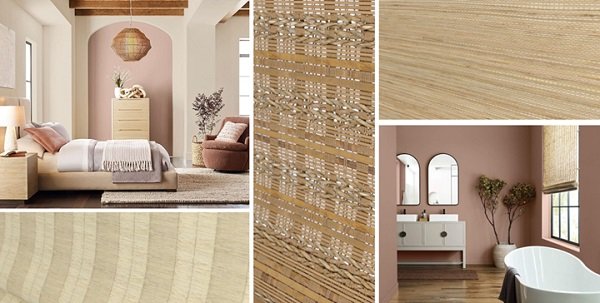
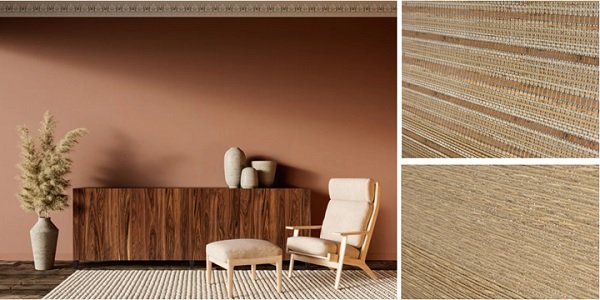
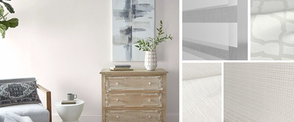
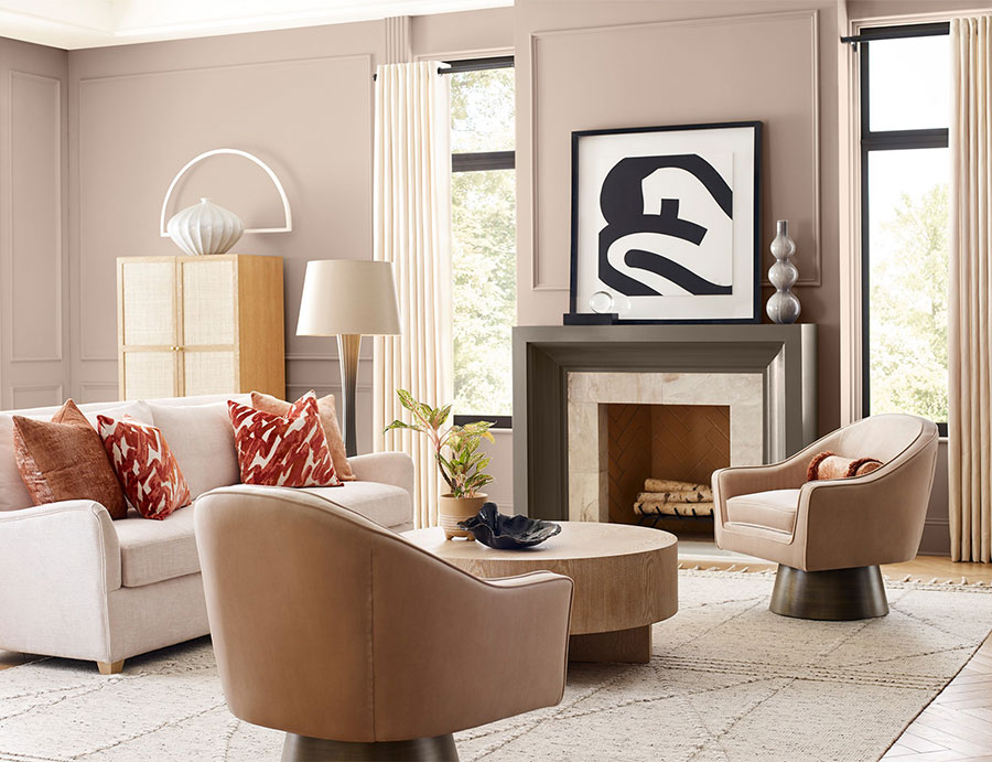
Desert Escape
Inspired by desert hues and our continued need to connect with nature, this collection of colors is a personal favorite. A compilation of Southwestern shades, all earthtones nodding to the soils of Arizona and New Mexico, easily transition from paint to furniture and accessories without friction. Our Blindsgalore Natural Woven Shades and Boutique Natural Woven Shades are diverse in texture and heaviness of hand, making them the perfect addition to rooms draped in desert tones.
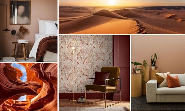
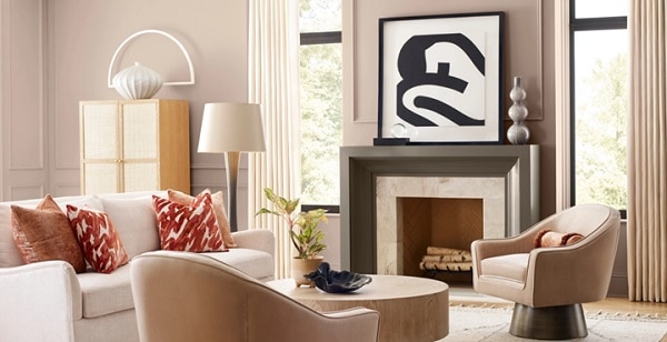
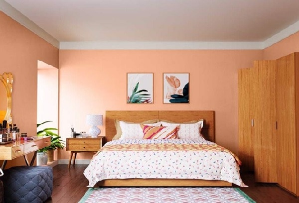
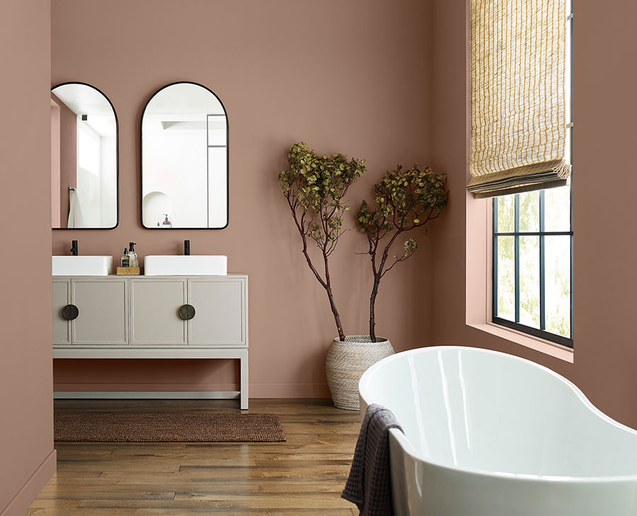
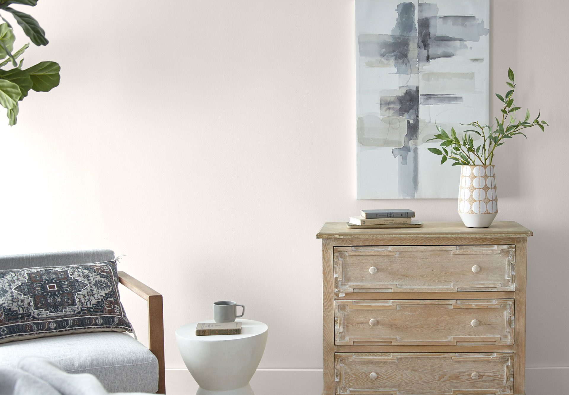
Coined 2023’s “it color” by leaders in interior design, the unique mid-tone clay of Sherwin-Williams Redend Point has the perfect pink undertone to add warmth and intrigue to any room. It is minimal yet cozy, creating an environment of quiet healing, making it an ideal color for bedrooms and places to gather.
Source: Cabrerabienesraices, Mondo Design
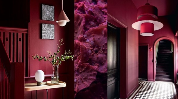
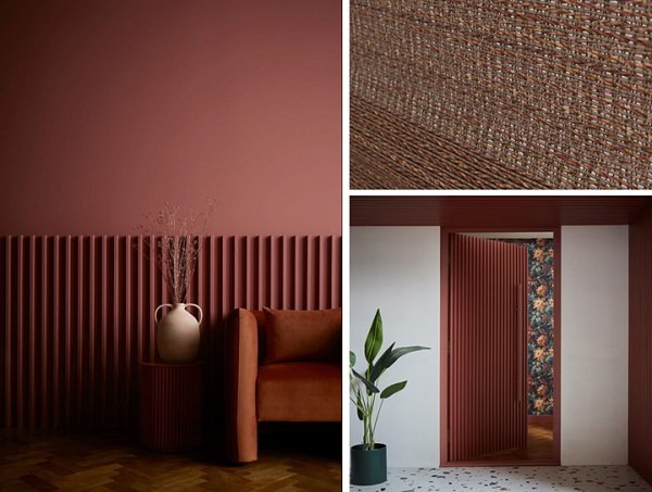
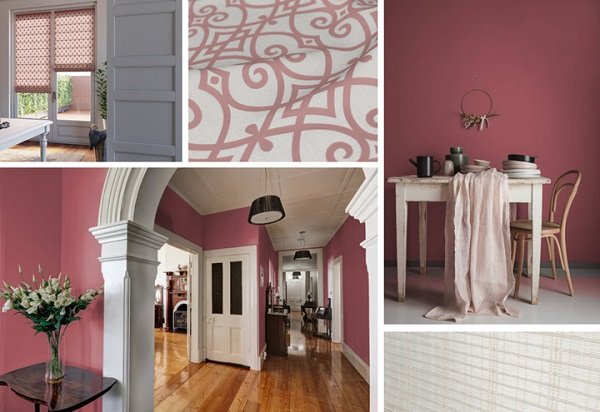
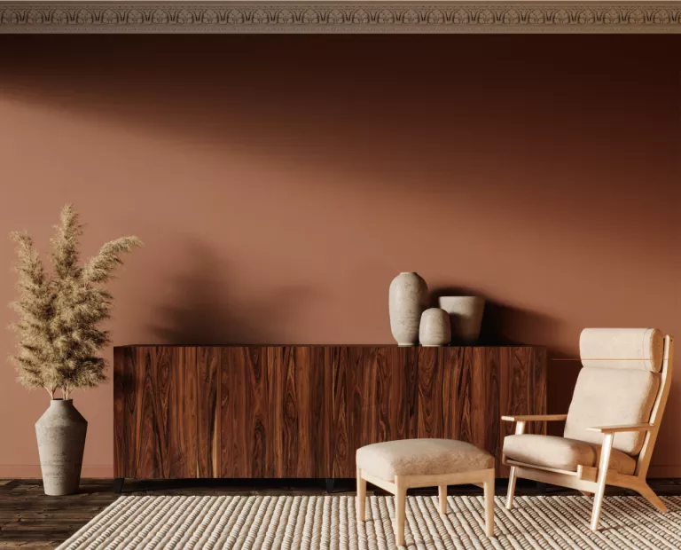
Alizarin
Alizarin by Graham & Brown is named after the red dye produced from the root of the Alizarin plant which was widely used in ancient India, Persia and Egypt. This rich, reddish brown color is ideal for creating inviting living spaces. Deep and moody, Alizarin saturates spaces, floor to ceiling with paint, furniture or accessories to create a cocooning effect. I find it is equally comforting as an accent to add richness and depth to any room.
Source: Prolist, Styling-id
Tiramisu
A warm, restorative cedar with copper undertones, Tiramisu by C2 Paint is grounded and sophisticated, creating a sense of comfort and oneness. Like other earthtones, leaning heavy into the warm colors from nature, evoke a cozy environment that provides an escape from the world outside. Why not embrace this color with the real flavor of a homemade Tiramisu, a popular Italian desert, made with Mascarpone cheese and coffee and Kahlua dipped ladyfingers, sprinkled with dark cocoa. Tiramisu is a favorite desert at my house.
Source: Deco=fr
Starting Fresh
An effortlessly refreshing off-white, Blank Canvas takes a different approach to interiors in 2023. Utilizing customer feedback, the color experts at Behr discovered that nearly 75% of homeowners found white made them feel calm and refreshed. With so many whites available, why choose to introduce one as a Color of the Year? While whites are the most approachable of all colors, they are notoriously difficult to nail down with the multitude of undertones. This particular shade is slightly warmer than most with the claim of fail-proof versatility. White walls means freedom reigns supreme, allowing for dreams to take shape and bloom without limitation. Window treatment options are also limitless, as anything goes with white, right? We love our Boutique Roman Shades and Blindsgalore Envision Solar Shades to maintain a clean shell for the rooms interiors to shine.
Source: Interior.ru
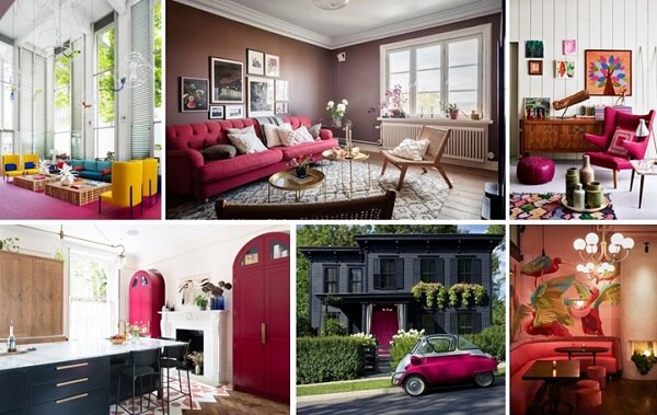
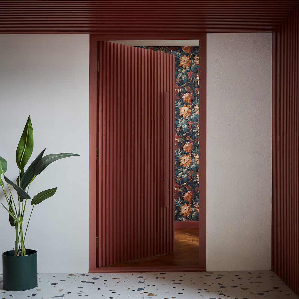
In Bloom
Richly saturated and reminiscent of a garden of roses, this collection of colors is far removed from the soft greens of 2022. Shades of peach and pink add a refreshing reprieve from previous years selections and are saturated and bold. All three hues are best suited to textiles, such as Roman Shades and Drapery, pillows and bedding.
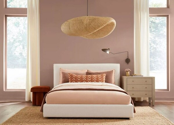
A soft, blushy peach that embodies golden hour clouds as the sun is setting and the sky is awash in an ethereal glow, Better Homes & Garden’s Canyon Ridge is a versatile color, content to cover four walls or play accent to any room.
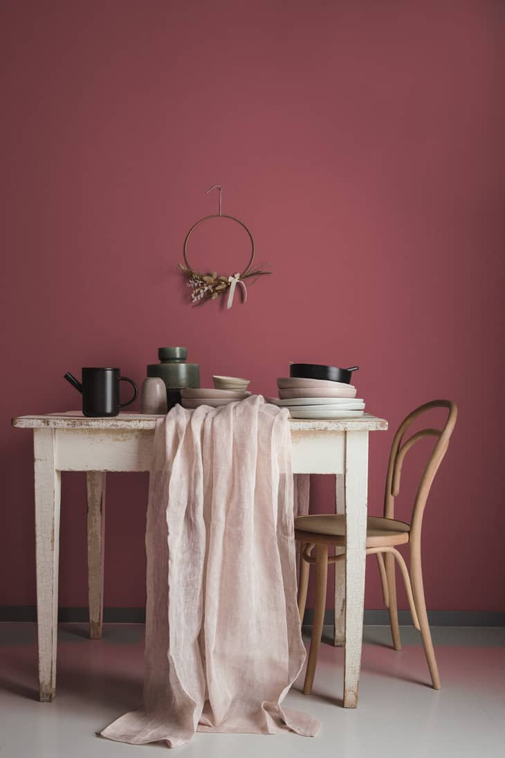
Part of its “Life in Poetry” palette, Dunn-Edwards’ Terra Rosa is a deep, rosy pink that heavily nods to the late 80’s/early 90’s floral trend and Victorian influenced vampcore. Many may find it difficult to commit to this color for its romantic vibe, but if your style veers toward the feminine, this pinkish, mauve shade can be spread on walls, textiles or wall art. Our Boutique Roman Shade in Paliside Rose is the perfect balance between white and rose in a modern scrolling trellis pattern.
Source: Hotel Leonor 1, 2
Raspberry Blush
Raspberry Blush by Benjamin Moore is perfect for a powder room or small-scale application. Adding a pop of color with kitchen appliances, framed art and, of course, flowers is a wonderful way to introduce this vibrant coral into any space. To really make a statement, cover the walls in color and keep design style and furniture minimal to create drama.
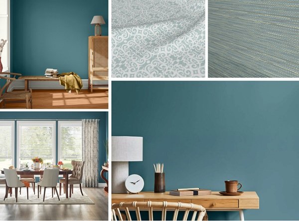
The Rebel
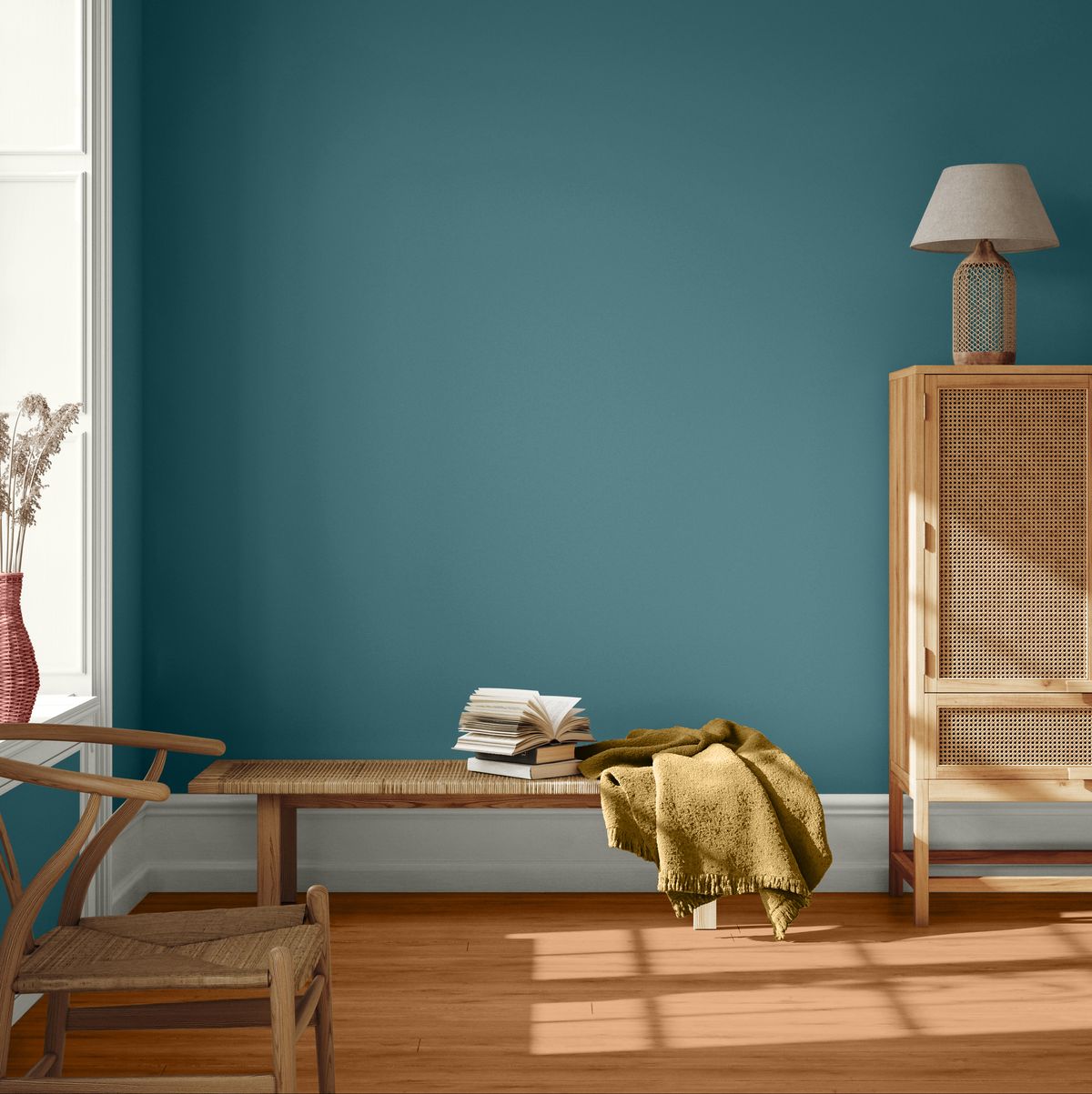
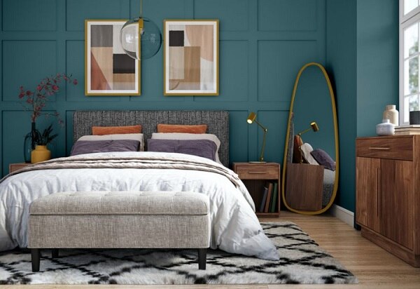
Standing boldly apart from the trends is “Vining Ivy,” a rich, blended teal that’s neither predominately blue nor green but a harmonious symphony of both colors and more, as adaptable as its namesake. This perfectly saturated tone would steal the show painted from floor to ceiling, including all trim and baseboards. Paired with neutral toned pieces in mixed textures, metallic accents and heavily placed botanicals, Vining Ivy can easily shine in heavily trafficked spaced, like the bedroom or living room.
Source: Interior.ru, Dupqmgrdwnev6
With the arrival of many diverse and lively color palettes, let’s hope for a bright future. If the color experts are correct, our future should be saturated with warmth, comfort and intensely rich horizons, heightened with a bit of rebellion. Bring it on 2023. We are ready for our lives to unfurl.