All of us who think about design and spaces that inspire us or calm us or make us feel good, love to cast color in a starring role. In honor of Halloween, now becoming one of our most celebrated holidays, I have some chilling facts about the derivation of colors and some scary origins of the colors we choose to enliven our lives and our homes. We can use these bright and bold colors on our windows to create a vibrant pop to any room or tone down the hue for a more subtle and soothing design.
Mauve
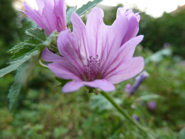
Mauve is a pale lavender color and arrives to us from France which literally means “mallow” which is a type of flower, pictured above. However, the color was first named by William H. Perkin, in 1856, when he was attempting to produce artificial quinine, a drug, which is still used as an antimalarial and anti-inflammatory drug and has a bitter, acrid taste. As he was experimenting with this process, an unusual residue remained in the bottom of his flask. This thick black substance turned purple when dissolved in alcohol.

Perkin realized that this Mauve liquid was highly adaptable to dyeing fabrics and the first aniline or synthetic dye was created out of a frightful coal-tar substance – not the soft purple color we recognize today. Perkin’s dye was called Tyrian Purple and renamed Mauve in 1859, when it was marketed. Today’s Mauve is a lighter, less intense hue with a blue-gray tint. However, Perkin’s accidental discovery of the synthetic Mauve dye, allowed color to become accessible and widespread in fashion and design.
Mauve creates a mellow mood.

Puce
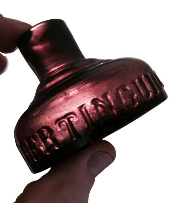
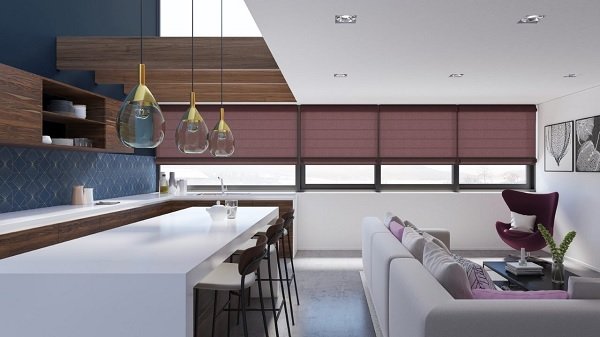
Many of us think that Puce is like puke–gory greenish, but Puce is really a dark red or purplish dark brown and is the French word for flea. This color is found on the underbelly of the flea and the Puce color represents the bloodstains on linen or bedsheets that remain from the flea’s droppings after they have been crushed. Yuck! Puce dates back to 1787, and was a popular color in 18th Century France and was noted to be a favorite color of Marie Antoinette, whose Palace of Versailles boasts 1,252 windows. Now, that is a lot of windows that need to be covered- in Puce? I doubt that, but today this color, for our modern styles, has taken on a moody, dispiriting Goth flavor. Puce, with its dark edges is a spooky color, but becomes a refined shade in our décor which exudes an old world charm.

Chartreuse
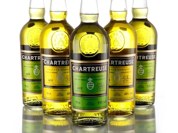
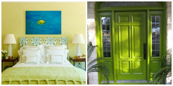
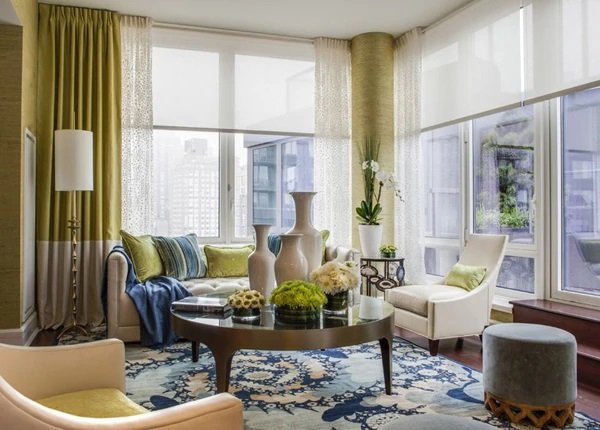
I put this color in not so much for its spooky derivation, but it just seems like a scary color. Its derivation comes from French Monks in the 1860’s, who made a yellowish-greenish, neon aromatic liqueur, Chartreuse, in their monastery, La Grande Chartreuse, near Grenoble, France. This intoxicating brilliant color with its fluorescent Frankenstein hue, shocks our sensibilities but continues to be an eye-catching and stylish accent in our homes. Chartreuse is a color that cannot be denied and I love saying the word. It never fails to impress!

Taupe
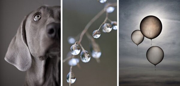
Taupe ranges from grayish-brown to dark tan and many neutral colors in between. The word derives from the French noun, Taupe, and originally from the Latin word, talpa, with both words meaning mole. A mole is an animal that lives underground and creates havoc in gardens and makes most people squeamish (more yuck factor)! Taupe is now a sophisticated color, but thinking about that slithering, burrowing animal with a long muzzle and small, beady eyes, gives me the shivers. But don’t shy away from Taupe as it harmonizes and softens a room, not at all a chilling color.


Crimson
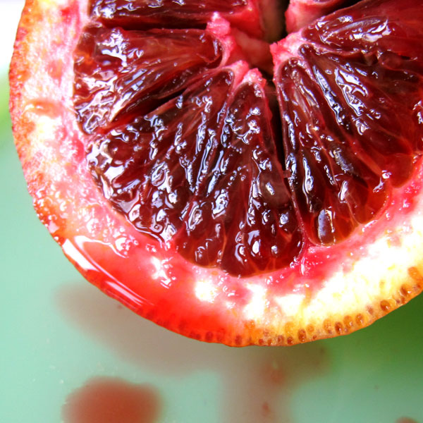
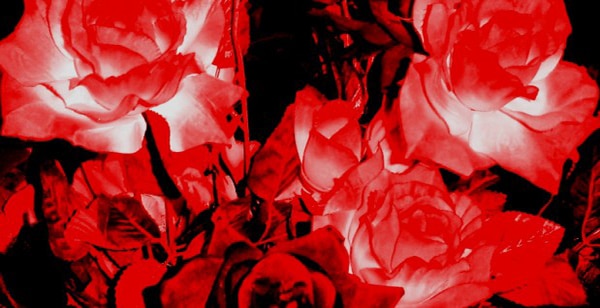
Now, consider the bloody, deep kiss of red. The word Crimson really comes from the Sanskrit, krim-ja, which is a dye product that is derived from the dead bodies of a small insect, the Kermes vermillio, creating a very dark, purple red. Our current use of the word Crimson has been recorded in English since 1400, and horror films and books have radicalized gory feelings toward Crimson and its blood red emotive effect. Crimson is, though, a beautiful color, full of depth and bold personality. A hot shot of Crimson highlights a sharp, contemporary mood. Crimson is strong, vibrant and alluring.
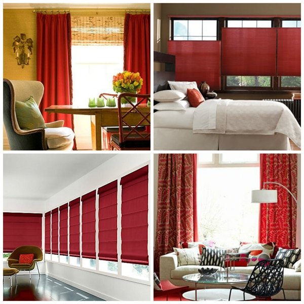
Color is intriguing, fascinating and captivating. Capturing the spirit of any color is a never ending journey.
Don’t let color scare you!