
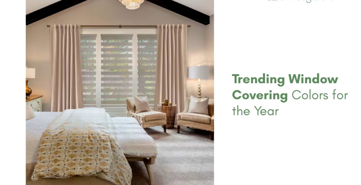
The window covering color trends for 2026 point in one clear direction: warmer, earthier, and more natural.
The cool grays and bright whites that dominated interiors for most of the past decade are stepping aside for tones that feel lived-in, grounded, and connected to the natural world. Warm sand, soft clay, muted sage, and rich cream are leading the shift, and the Pantone Color of the Year, Cloud Dancer, has pulled crisp warm white back into the conversation as a design-forward neutral rather than a default.
What are the trending window covering colors in 2026?
Five color directions are gaining ground across blinds, shades, and drapery. Each one reflects a broader interior design shift away from cool minimalism and toward organic, textured warmth.
Warm neutrals
Sand, oat, warm greige, and cream are the new baseline. Warm neutral window treatments pair with the warm-toned walls, natural wood furniture, and textured fabrics that define the current “quiet luxury” aesthetic. Roller shades in linen tones and cellular shades in soft cream are two of the most popular color combinations. For how these tones anchor a room, the Spring Fling feature captures the look.
Earthy greens and blues
Sage, olive, muted teal, and forest green are moving from accent walls into window treatments. Green and blue window coverings bring a nature-rooted calm that pairs beautifully with warm wood tones and natural fiber rugs. Roman shades and drapery in soft sage or deep forest green are the strongest expressions of this trend.
Cloud Dancer white
The Pantone Color of the Year for 2026 is Cloud Dancer, a warm, slightly creamy white that reads softer than the stark cool whites of previous years. White and off-white window treatments in this tone feel fresh without the clinical edge that pure white can bring. Roller shades, cellular shades, and sheer drapery in Cloud Dancer white suit nearly every room and every design style.
Terracotta and clay
Warm terracotta, clay, rust, and cinnamon tones are gaining traction as accent colors for window treatments. A clay-colored Roman shade or a rust-toned drapery panel adds warmth and personality to a neutral room without overwhelming it. The key is using these warmer saturated tones as focal accents rather than whole-room drenching. The guide on Hello Sunshine, Goodbye Glare covers how color choice interacts with light management across sun-facing windows.
Rich browns and warm taupes
Dark chocolate, espresso, and warm taupe are the deeper anchors of the 2026 palette. Wood blinds and faux wood blinds in these tones connect the window to hardwood furniture and flooring, creating a cohesive warmth across the room. For rooms with existing neutral walls and natural wood, a dark warm blind is the fastest way to make the window feel intentional.
What colors are going out of style?
Two colors are losing ground:
- Cool gray, the dominant choice for the past decade, is being replaced by warm greige and taupe in most rooms. Gray still works in modern and industrial interiors but no longer reads as the fresh default.
- Pure stark white, especially in matte or flat finishes, is giving way to warmer off-whites and creams. The shift is gradual, so existing gray and white treatments are not suddenly dated; they just no longer feel current.
How to choose a color that lasts
Window treatments are a longer-term commitment than a wall paint, which makes picking a trend-proof color worth the extra thought.
Choose warm neutrals for longevity. Sand, cream, warm white, and taupe work across multiple design trends and do not feel tied to a single year. A warm neutral shade will look current five years from now because the color itself is timeless and only the styling around it changes.
Order swatches before committing. Colors look different on screens than in fabric, and they shift noticeably between morning light and evening light. Holding a physical swatch against the wall in both conditions is the only reliable way to confirm the match. The guide on How Long Do Custom Blinds Last covers what to expect from the fabric’s color and finish over its lifespan.
Use bolder colors as accents. Sage, terracotta, and forest green make beautiful statements on a single window or in a room where the treatment is the design feature. For whole-home coverage, anchoring in neutrals and accenting with color gives flexibility to change later without replacing every shade. For the broader picture of how treatments, color, and room design work together, the Ultimate Guide to Window Treatments covers every angle, and the guide on Dual Sheer Shades shows how layered fabrics add depth to neutral palettes.
The colors that feel right now
Trending window covering colors in 2026 lean warm, earthy, and natural. Warm neutrals for the base, muted greens and Cloud Dancer white for freshness, terracotta and rich brown for warmth and personality. The shift away from cool gray is real, but the move is toward warmth, not toward anything extreme, which means the choices trending now are the ones most likely to still feel right in years to come.
All Blindsgalore brand treatments are custom-built to order and backed by a 3-year limited warranty upgradeable to five years. Browse the full collection by color to see what is available across every treatment type, and order free samples to hold the fabric against the wall in your own light. Call the in-house experts at (877) 702-5463 for help choosing.
Frequently asked questions
Warm neutrals (sand, cream, oat), earthy greens (sage, olive), Cloud Dancer white (Pantone Color of the Year), terracotta, and rich browns are the leading window covering color trends for 2026.
Cool gray is declining in popularity as warm neutrals and earth tones take over. Gray still works in modern and industrial interiors, but warm greige or taupe now reads as more current in most rooms.
Cloud Dancer, a warm, slightly creamy white that reads softer than pure white. Window treatments in Cloud Dancer white suit nearly every room and design style.
Matching creates a cohesive, color-drenched look. Coordinating (same family, slightly different tone) is more common and gives the room subtle depth. Contrasting works when the treatment is the design accent.
Choose warm neutrals for longevity, use bolder colors as accents rather than whole-room coverage, and order physical swatches to confirm the color against the wall in both daylight and evening light.
Blindsgalore brand treatments carry a 3-year limited warranty with a free upgrade to a 5-year warranty, covering defects in materials and workmanship when properly installed. Boutique products include a free 5-year extended warranty. Fading is not covered.